iTrees Case Study
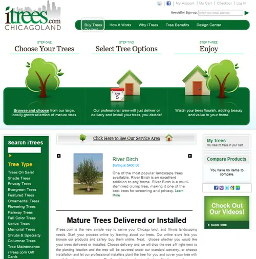
Before

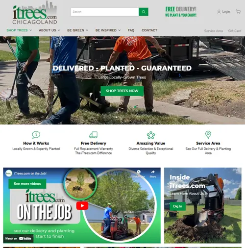
After

The Challenge
iTrees had a site that looked like it was from a previous era on the internet. It looked out of date, and it didn’t give visitors a compelling reason why they should choose itrees over other nurseries
It also had a long and challenging checkout process that customers sometimes found difficult to get through. It was especially challenging on mobile devices.
They needed a make over.
The Solution
iTrees got a modern looking site that more clearly demonstrated the value of what they offer.
It started with an image at the top that helps people visualize what the experience of buying from them looks like, then it had callout for the specific things their customers want.
We put videos on the home page because trees are a very visually appealing product so we wanted people to be able to see what they look like.
Results
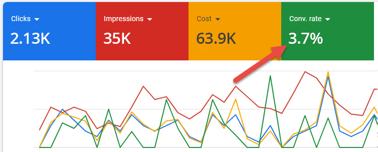
Before

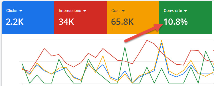
After

Key Tactics
- Identify and address key customer concerns – One of the main issues people have when they are thinking about buying a tree is that they don’t know exactly what it will end up looking like. Everybody knows what a tree is, but picturing the exact end result is different. We decided to put videos right on the home page to show people what the trees look like in real life so they know what they are getting. That made people more comfortable with the idea of buying from iTrees.
- Modern look and feel – Often when you visit a website you might notice that it looks good or bad but you don’t really know why. The job of a website designer is to make your site look gorgeous without you even needing to think about it.
- Easy Checkout – The checkout process can make or break an e-commerce business. It must be easy to purchase ESPECIALLY on mobile. 55% of all internet traffic in the US comes from mobile devices and normally the conversion rate on that traffic is 2/3 lower than on desktop. It is critical to optimize your site to convert well on mobile.